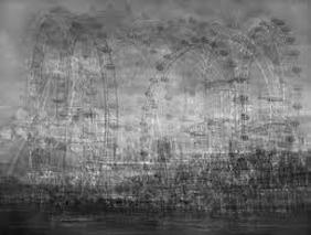
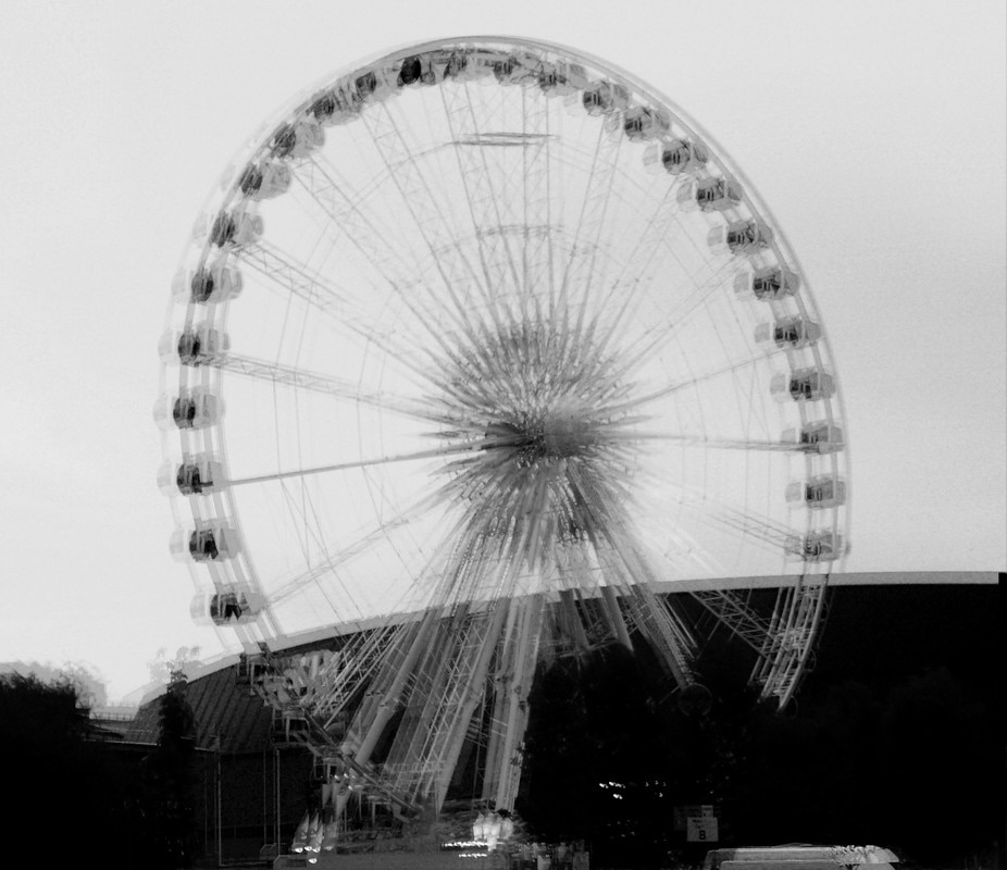
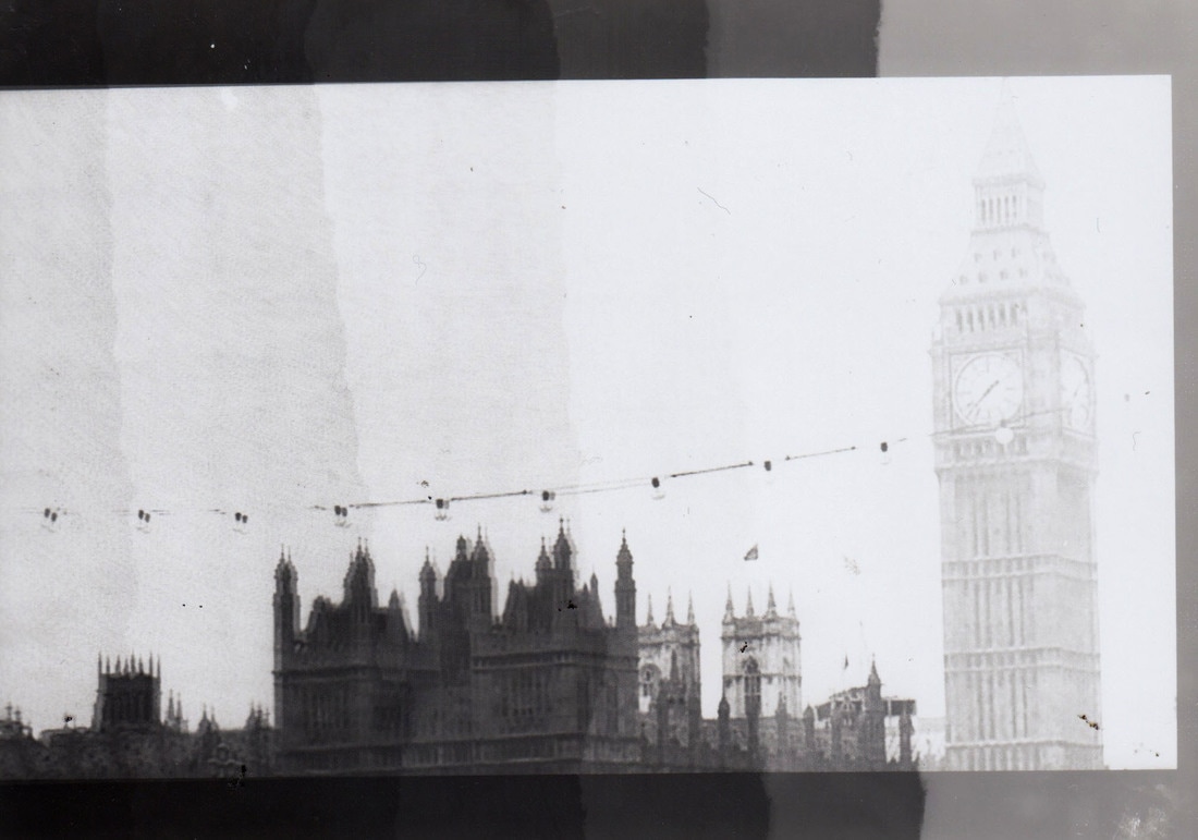
This photographer takes images of iconic buildings which he then layers them but from different angles so you are seeing the building in more than one place. Also with the image being in black and white it gives it more of an old look. With the images being layered over each other in different ways so you can see each part of the building it makes the person more intrigued to look at it. The contrast of these images are high as the images are seen to be more grey and white other than black and white with the images being like this they aren't overwhelming as they would be if they were bolder. The lighting used is just natural daylight as it is an outside area so no extra lighting is needed.The image does include some background which is mostly the negative space. The image would of been digitally manipulated as the images have been layered and rotated to make the effect the photographer was looking for.
Edits
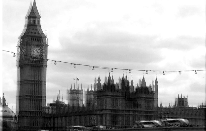
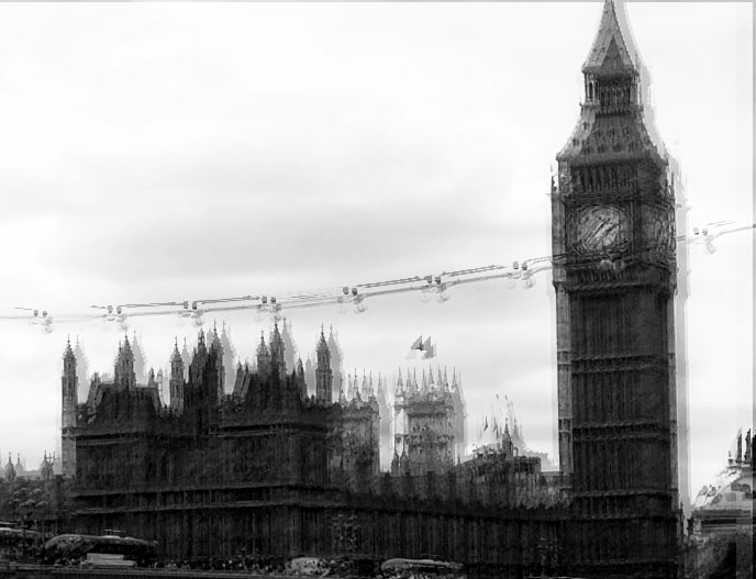
These Edits have been digitally manipulated to try and get a similar result to the photographer Idris Khan. There are some differences in my work to the photographers work but have both come out with the same effect for the final edits. Firstly the artists images have a lot more layers on than my edits as my edits have several layers which have been moved slightly. Also the images I have edited are a lot more toned and have more black tones whereas the artists image is a lot more grey toned. The edits which I have created also have much more skyline in them as they are much brighter and more toned than the photographers image. The edits I have created have more white tones in them compared to the greyness of the Idris Khans photos. These edits did not have alot of time to complete as we see in Idris Khans image he has a lot more layers which has took the artist time to do where as there was a limited time to do these so not as many layers have been multiplied.
Development
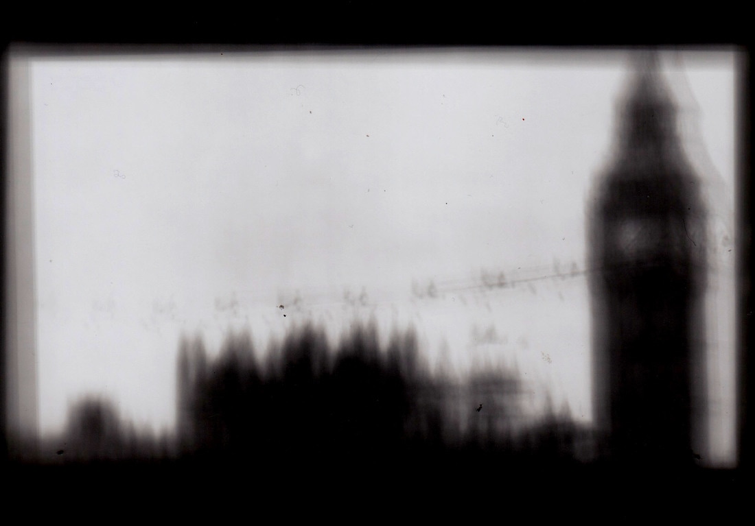
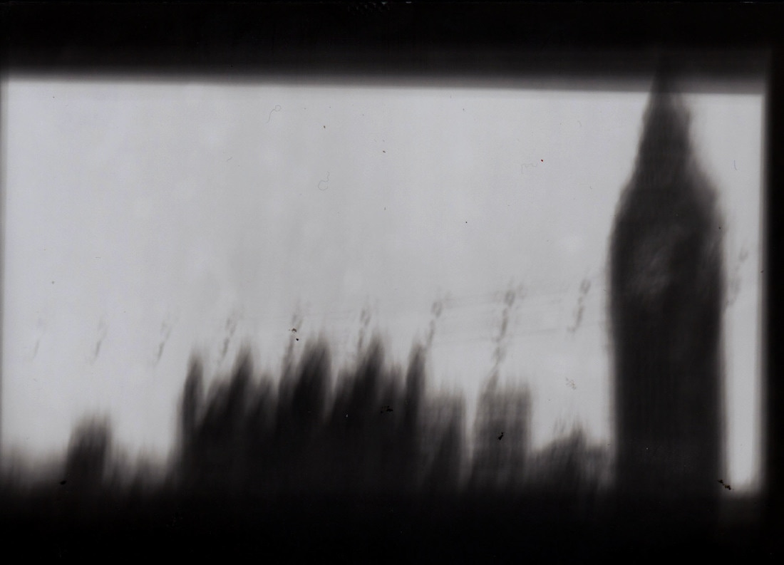
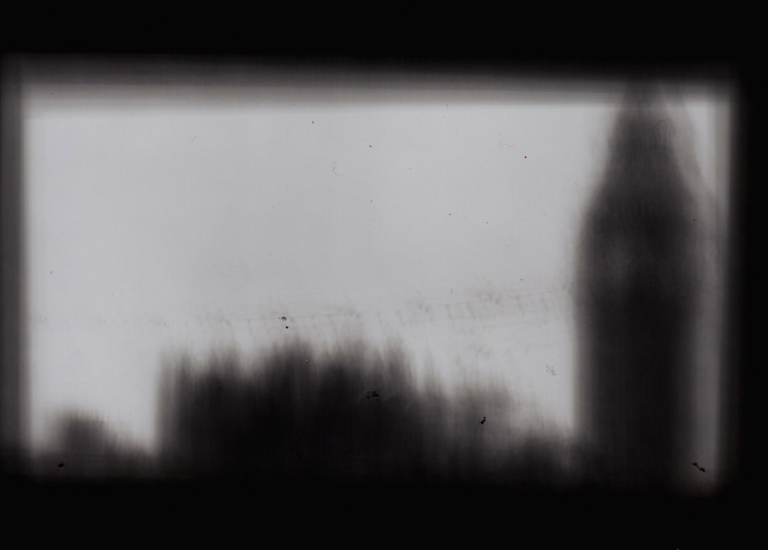
For further ideas I have developed one of the edits of Big Ben in the dark room to show how other strategies can give the same overall result. First of all the first image was an experiment image to show which one would be a suitable time for the light to last for. Each section of the image was 2 seconds so each part got either 2,4,6,8,10 or 12 seconds of light. We can see that the part of the image which has been exposed to more light is darker than the part of the image which has been given less light. By doing this experiment image we can then see how long we need to expose the image for the time which was most accurate for us to use was 10 seconds. The setting used was F8 to give it the best chance of the image being captured onto the light sensitive photo paper. Firstly the original image was printed onto acetate to make sure light could reflect through it. To create the blurriness of the image I moved the acetate slightly when the light was projected onto it and kept moving the acetate slightly until the projection light went off, so when the image was developed in the chemicals the images would come out blurry and unorganised just like the edits and artist photographs. When the images had dried they were then scanned into the computer and digitally manipulated. The images were further edited by using the levels tool which made the images darker this was done so the full effect of the blurriness was given and to also help the image become more exposed from the background, with the building being darkend it helped it become more enhanced from the skyline so the layers of the buildind could be seen.
Overall the dark room experiment worked which helped with the shoot I had done, with thi experiment linking in well it helped everything link together.
Overall the dark room experiment worked which helped with the shoot I had done, with thi experiment linking in well it helped everything link together.
